Crafting a diverse branding to complement this culinary fusion was our Favo-rite thing.
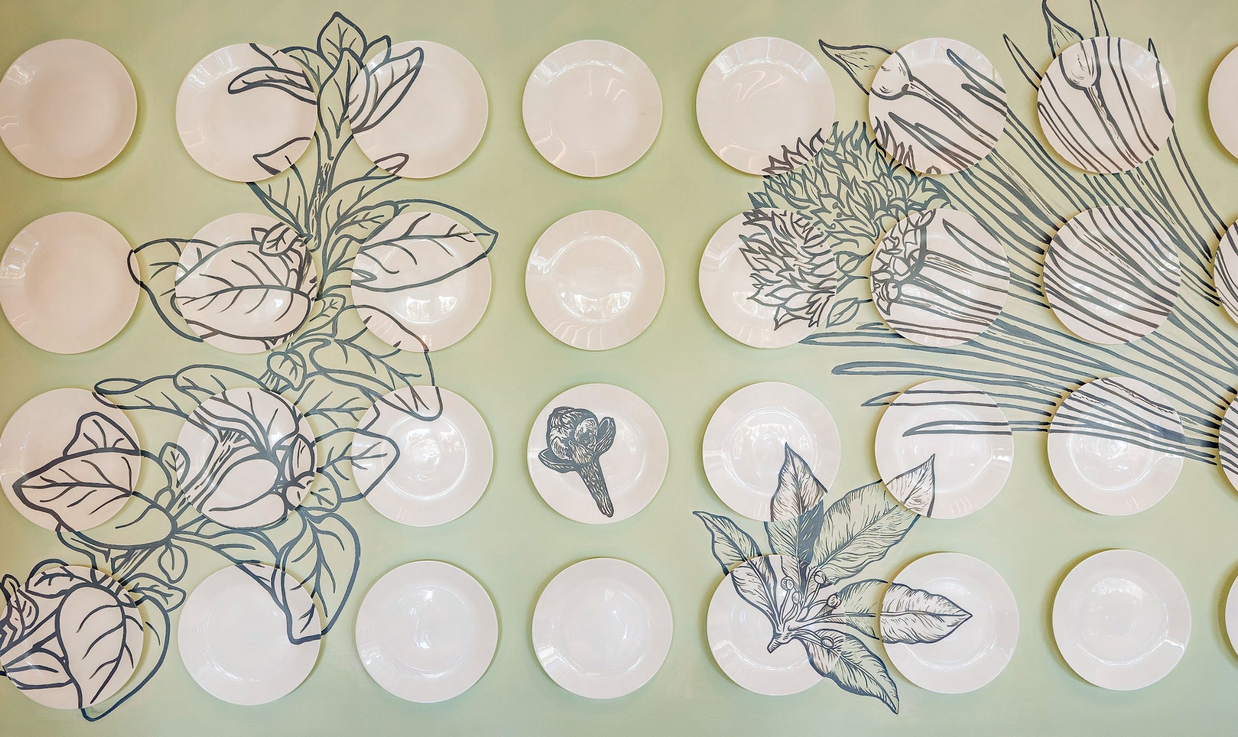
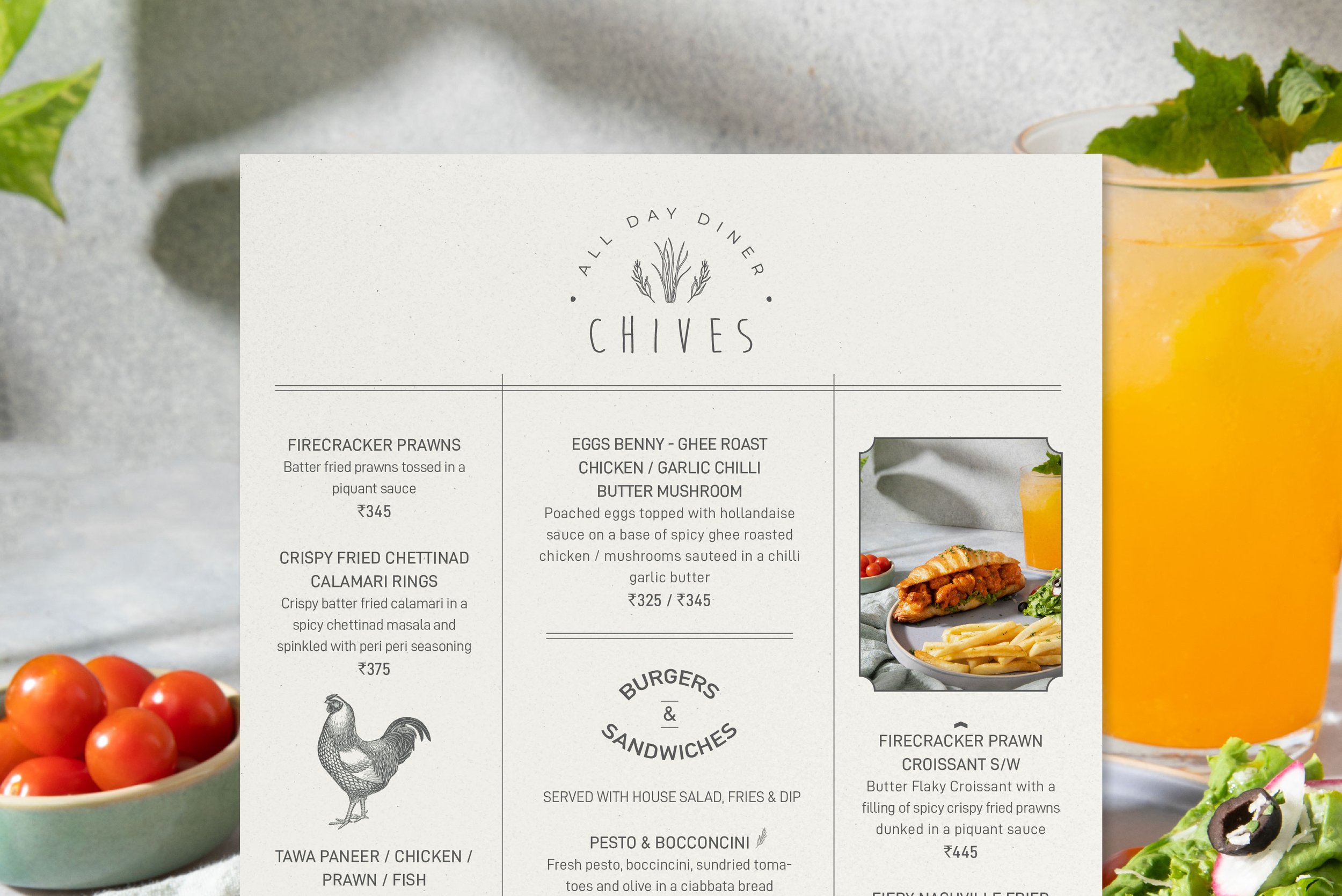
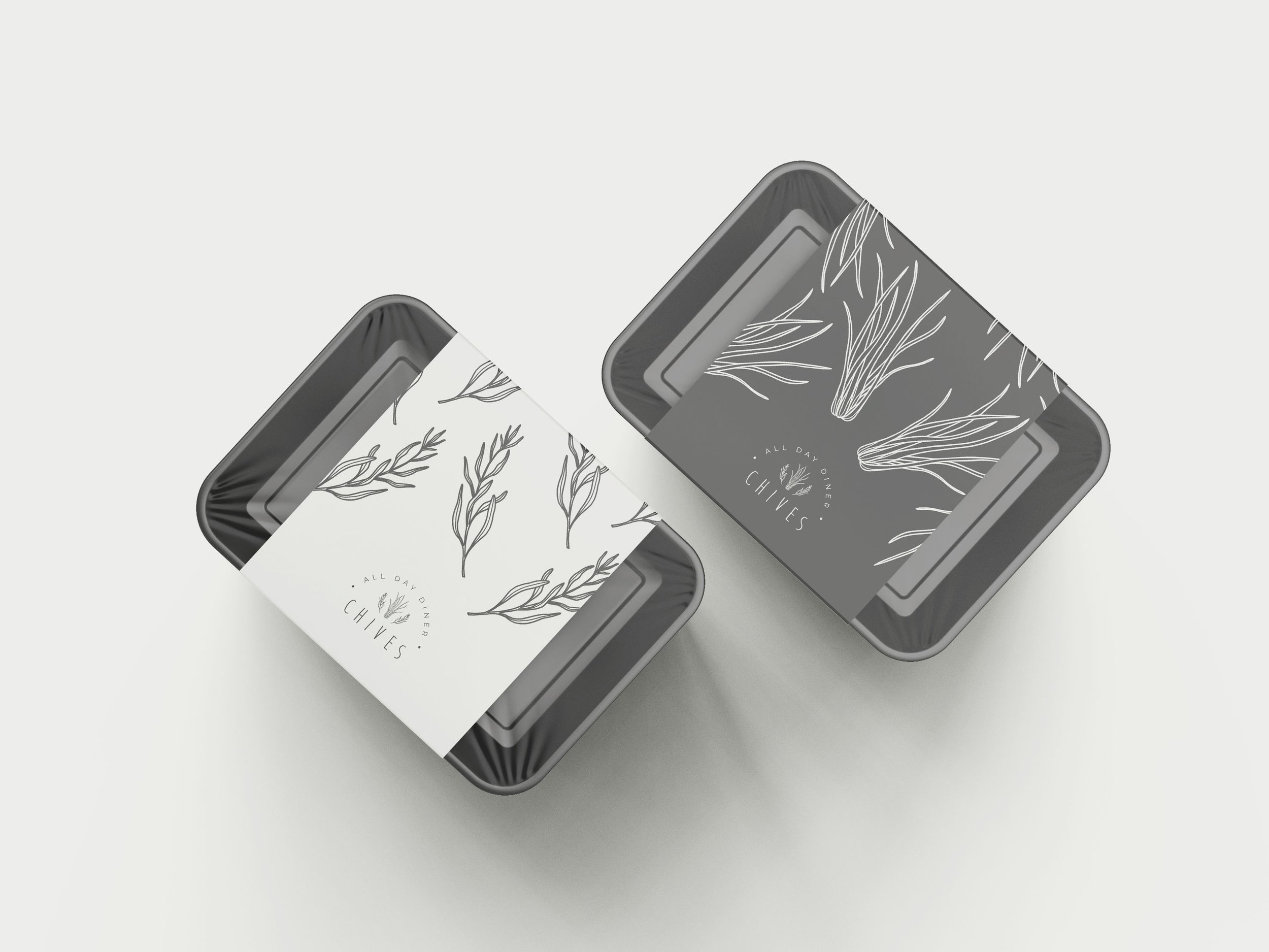
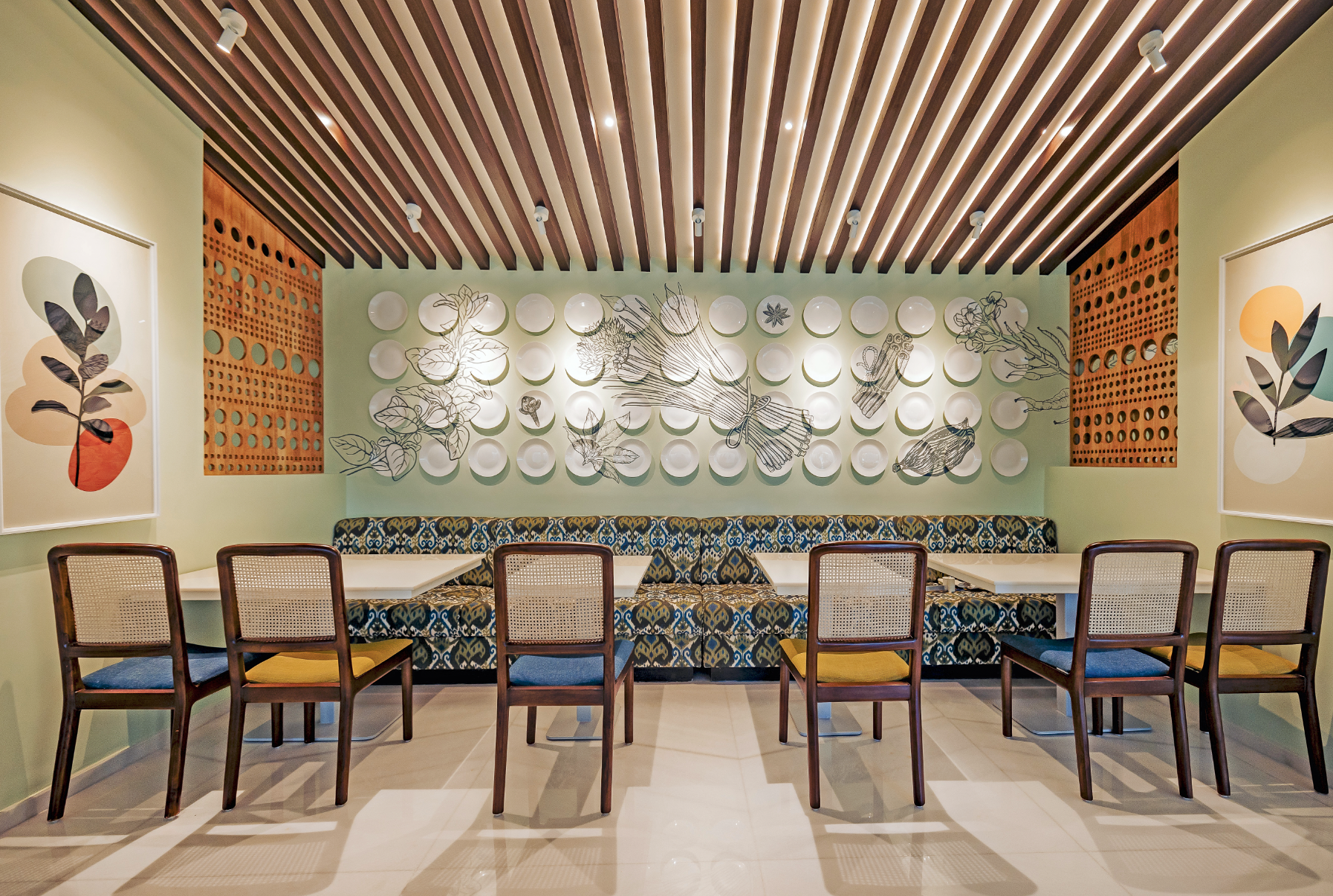
Juggling three distinct branding projects under one roof has been quite the adventure, but we've infused every step with style and flavour. First up, Chives, the all-day diner, boasts charming hand-drawn ingredient illustrations and crisp typography for a rustic yet polished feel. We've opted for a neutral color palette to allow for the other brands to coexist seamlessly under the same roof.
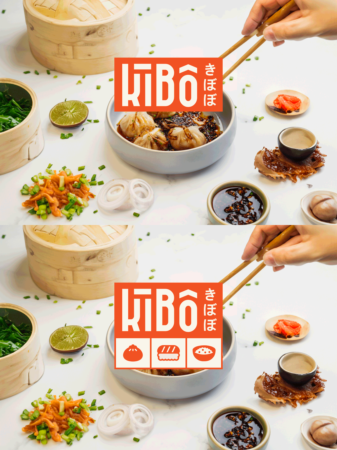
Then there's Kibo, our Asian fusion hotspot, where the logo channels the vibrant energy of Chinese and Japanese street signs, with typography mirroring the graceful strokes of the Japanese alphabet. Playful iconography featuring beloved Asian dishes adds a delightful touch, complemented by a vibrant color palette and lively language, giving Kibo its trendy and upbeat vibe.
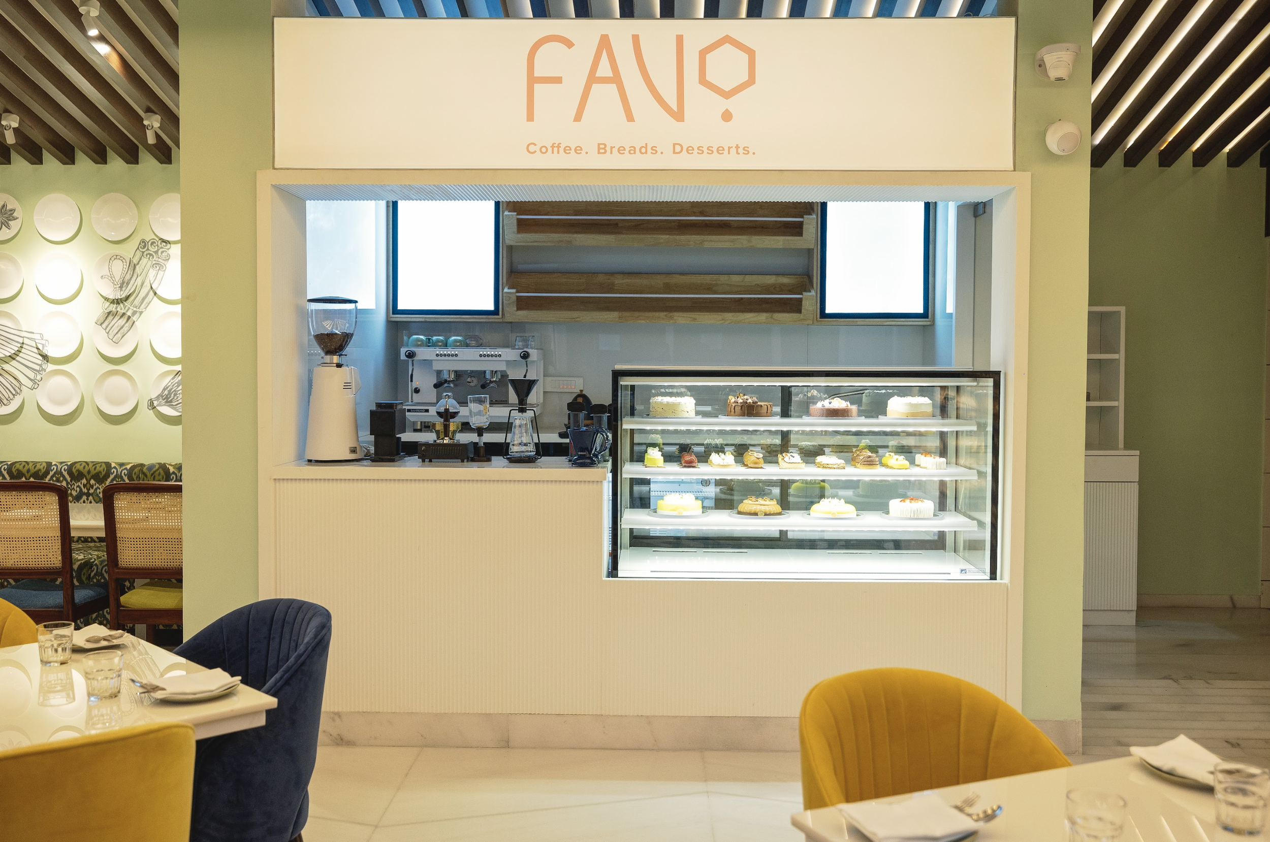
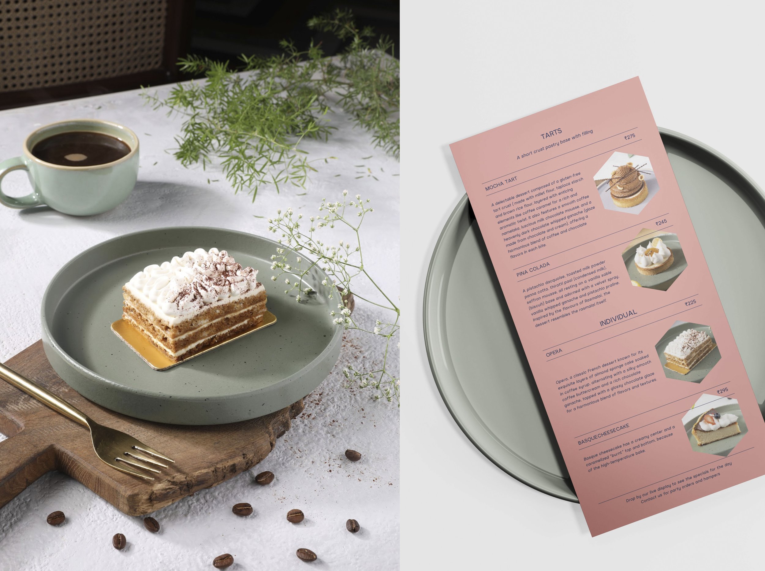
And let's not forget Favo, our cozy coffee and desserts cafe, where sleek modern typography meets geometric shapes, echoing the artistry of coffee pouring. Soft blush and azure tones were elegantly brewed into the coffee branding, creating a blend of sophistication and charm. Like a dynamic family, each brand brings its own flair, yet together they cook up a diverse culinary experience that's both laid-back and striking. We just cannot pick a Favo-rite!

