Choose My Bicycle’s rebranding pedals the brand confidently into the future.
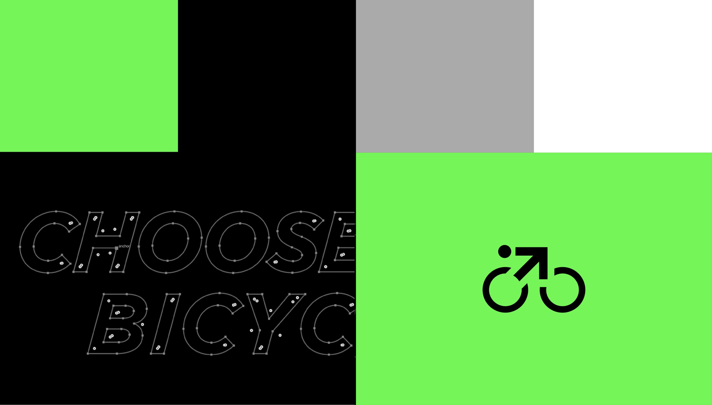
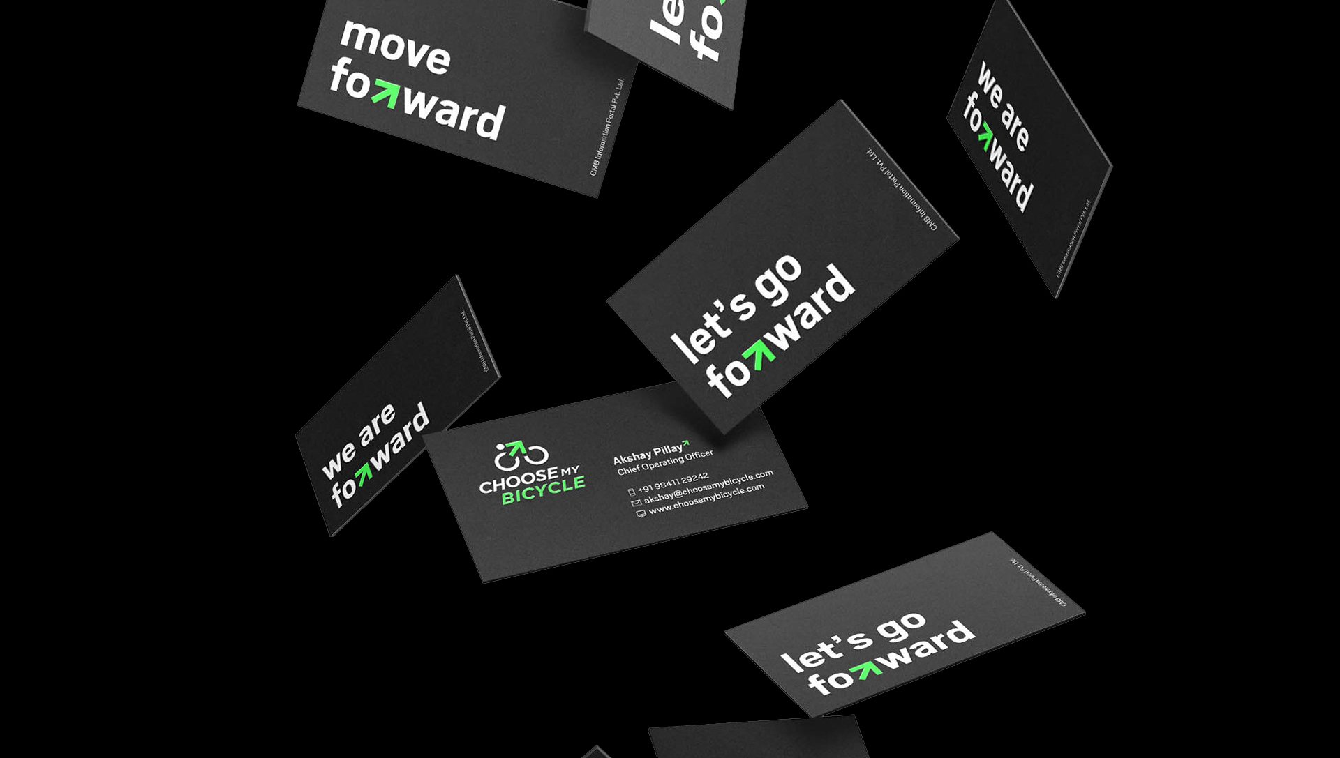
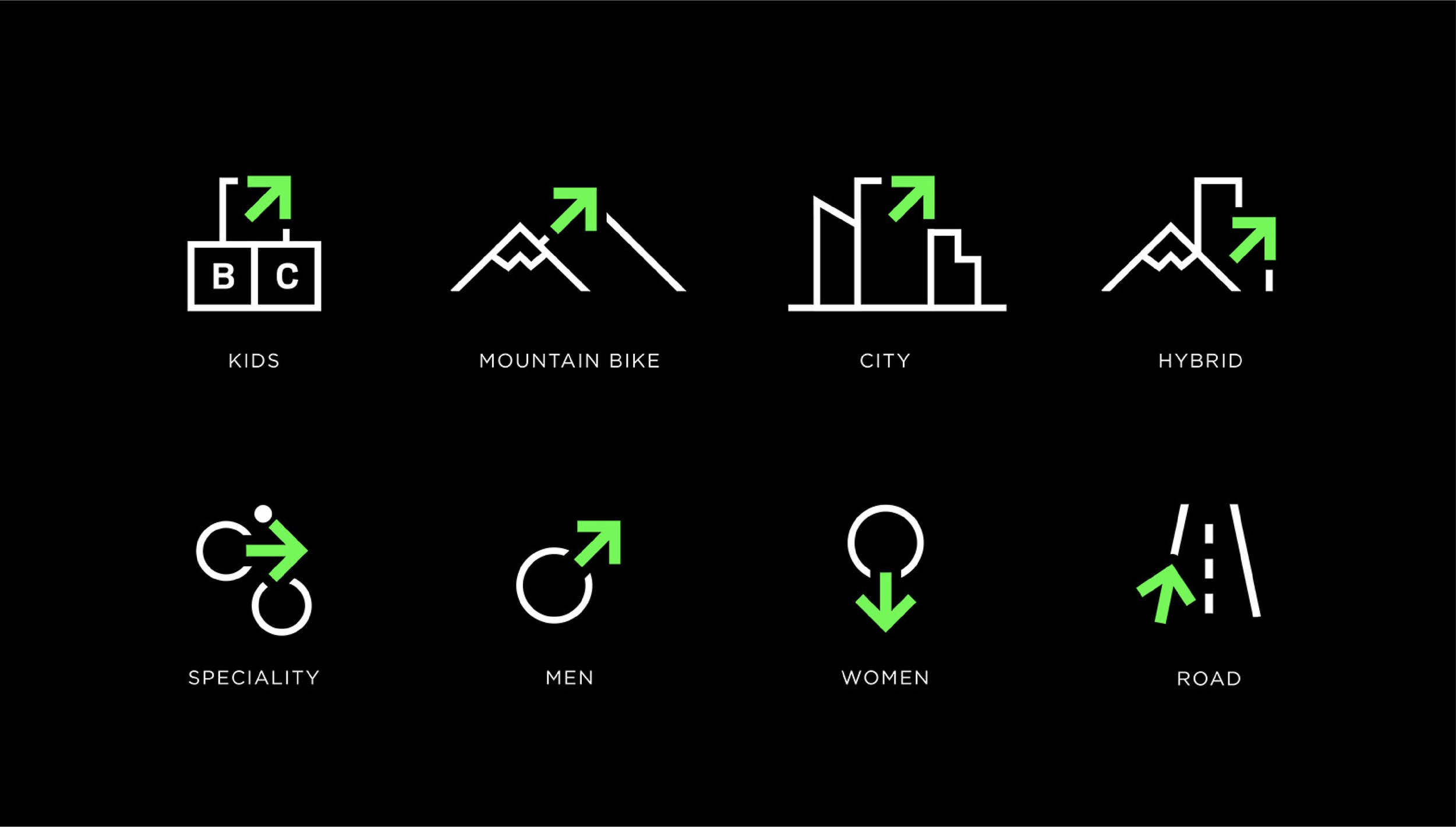
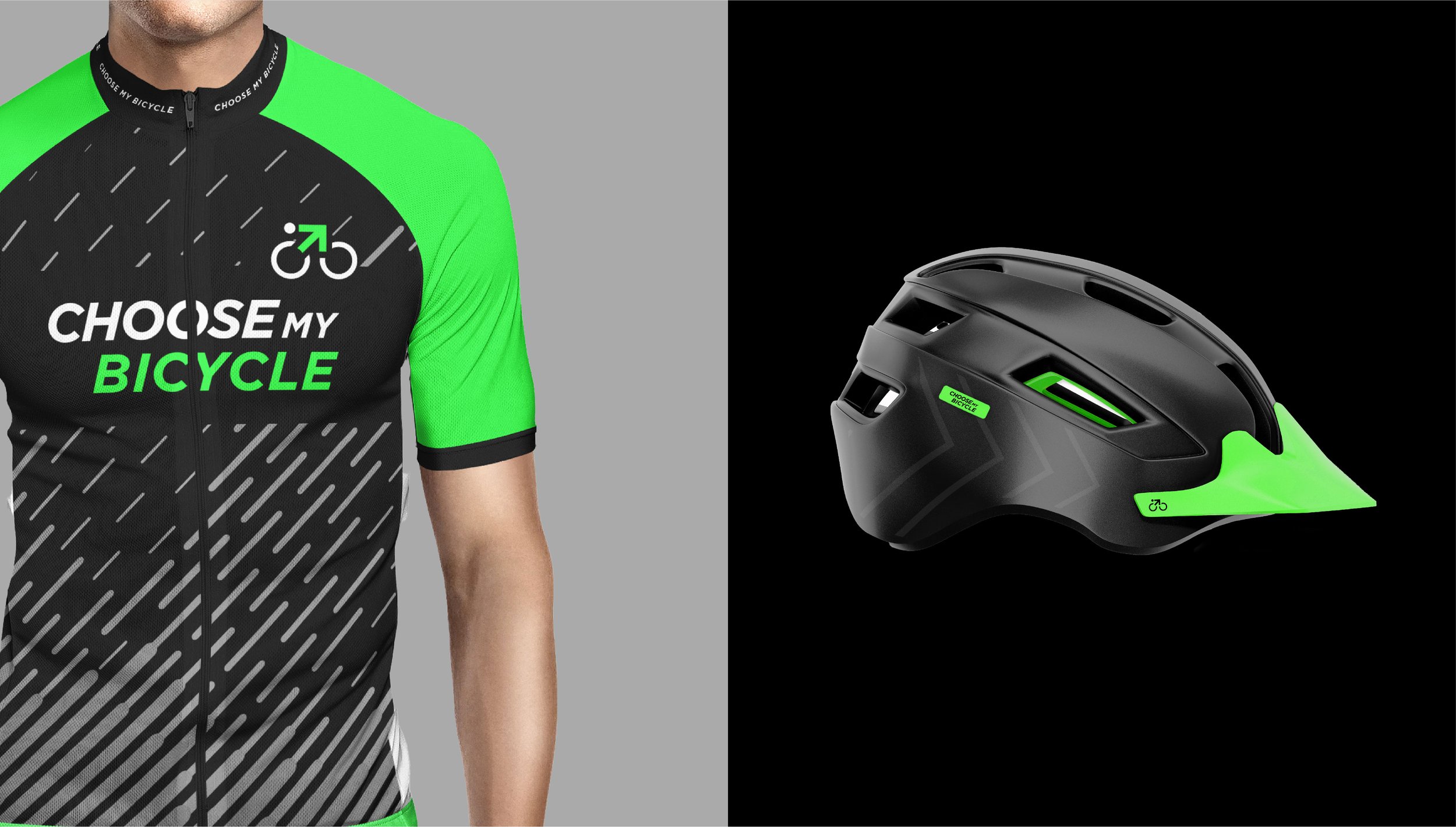
Choose My Bicycle, a leading force in India's bustling online cycling realm, embarked on a bold rebranding journey to carve out its unique niche in a crowded market. Infusing the brand with a dynamic blend of sporty charisma and playful wit, this transformation injected new life and personality into every interaction. At the heart of this evolution lies the iconic neon arrow from the logo, serving as both a symbol of progress and a beacon of distinction. Seamlessly integrated across all facets of branding, it propels the brand forward with unstoppable momentum, setting it apart in myriad ways.
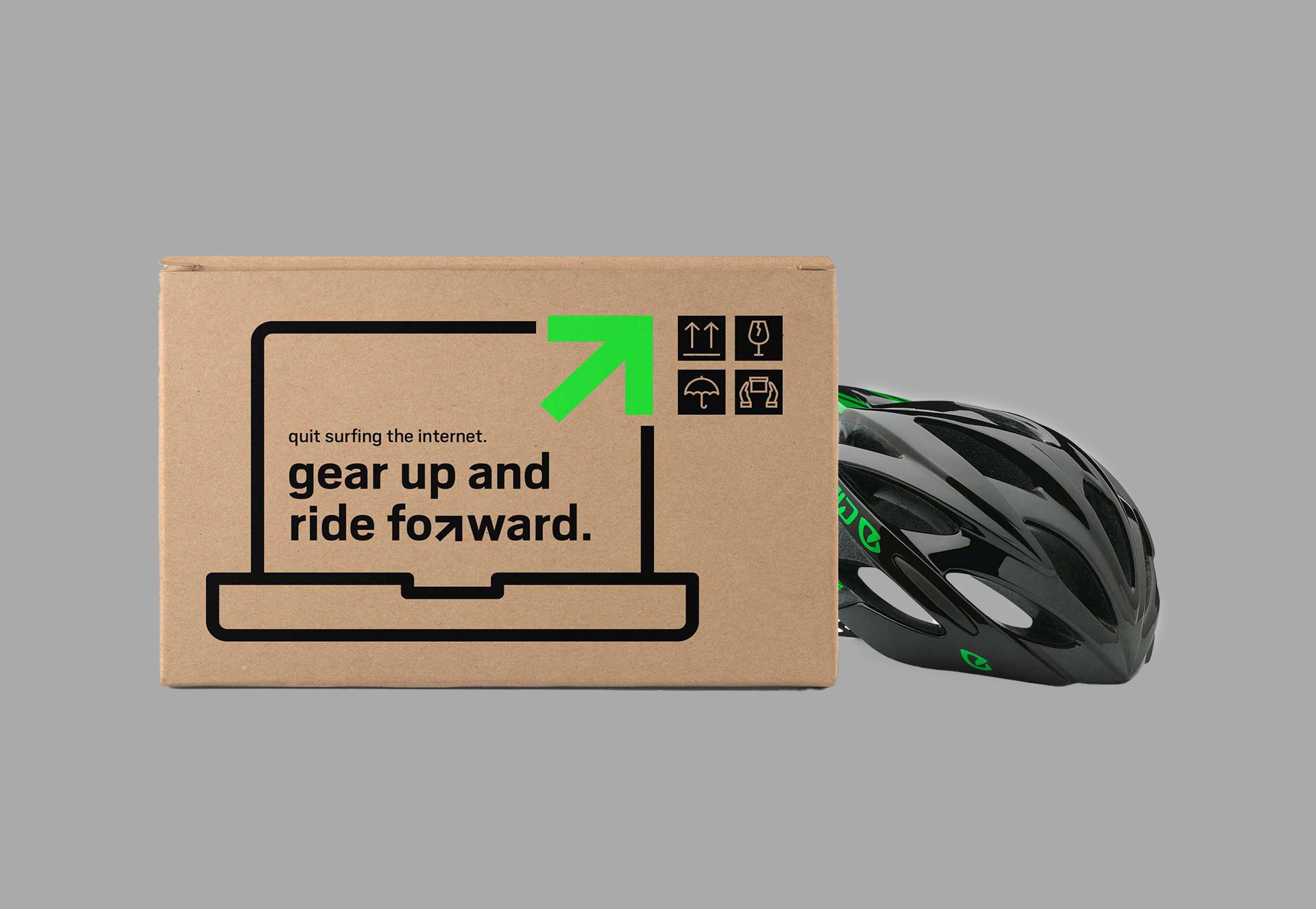
Furthermore, the brand's ingenious packaging design adds a touch of intrigue and sophistication. Mimicking the appearance of high-end technological cargo, it prompts delivery personnel to handle each package with the utmost care, elevating the customer experience to new heights. In essence, Choose My Bicycle's rebranding is not merely cosmetic; it's a strategic reinvention that embodies innovation, personality, and a commitment to excellence.
